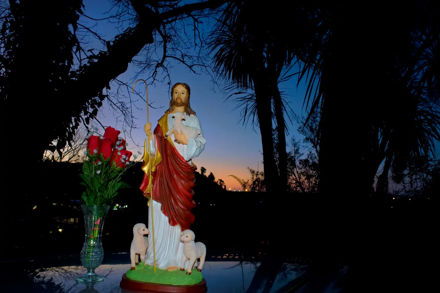
St Joseph’s twilight muster: horizontal
July 25, 2018 12:27 pm


St Joseph’s twilight muster: horizontal. 5.43pm, 18 July 2018
This twilit tableau was the runner-up in my series of St Joseph with a vase of faux flowers. It ranks as “runner-up” only because it’s entirely moon-less, the crescent moon (the object of the whole exercise) being too high in the sky to be included in a horizontal composition. However as a simple set-up, this seems a more compelling image to me. I like the good range of colour and how the flash balances with the background lighting. It also has some artistic black space on the lower right, suitable for a quote (or headline), and I have supplied an anonymous, satirical example of such below.
In comparing the impact of this standard horizontal image with the earlier vertical frame, isn’t it an odd truth that the old 35mm format of 2:3 works much better for horizontals? The 2:3 format seems too long and narrow for most vertical applications, where 4:3 is often a better fit. That aside, good vertical compositions are generally harder to achieve than horizontal ones, yet verticals are so much to the fore these days – thanks of course to the demands of Instagram, Pinterest and smartphones.

St Joseph’s twilight muster, with quote
1.3 secs at f22. Nikon 28mm; ISO 250. Flash
Posted by Barney Brewster
Tags: composition, figurine, film, flash, formats, long exposure, Nelson, Nikon D700, quotes, trees, tripod, twilight, vertical frames, wide angle, winter
Categories: Embedded quote, Twilight photography